Less is Bore Where Function meets Style
“Less is More” is a phrase we’ve all heard. It is linked to minimalism in art and architecture. It was first used by Mies Van Der Rohe. Modern architects started associating this quote with functional designs and they emphasised on the idea of extreme simplicity. A few years later a new term started doing the rounds – “Less is Bore”. It was coined by Robert Venturi, one of the major architectural figures of the 20th century. As the phrase suggests, it is associated with postmodern architecture, ornate designs and expressive forms. It is actually a commentary on minimalism and focuses on maximalism. It emphasises on the return of highly stylised and decorative styles, and architecture and interior design that is loud yet classy. Think of it as going “all out” in interior design.
Harmony in Diversity
Just like how “less is more” embodies clarity and timelessness, “less is bore” rides on creativity, expression, historical references, individuality and abundance.
These days if you notice most homes look the same from the inside. That is because everybody is focusing on minimalism. While there is nothing wrong with that, nobody is ready to look at the other side of the spectrum. The purpose of interior design is to create a functional yet stylish home. That is what students studying design and decoration courses are also taught. We’ve got so used to Pinterest-worthy homes that somewhere the inhabitant’s individuality is lost. For this reason, maximalism is making a comeback.
Maximalism in Interior Design: How to Embrace It?
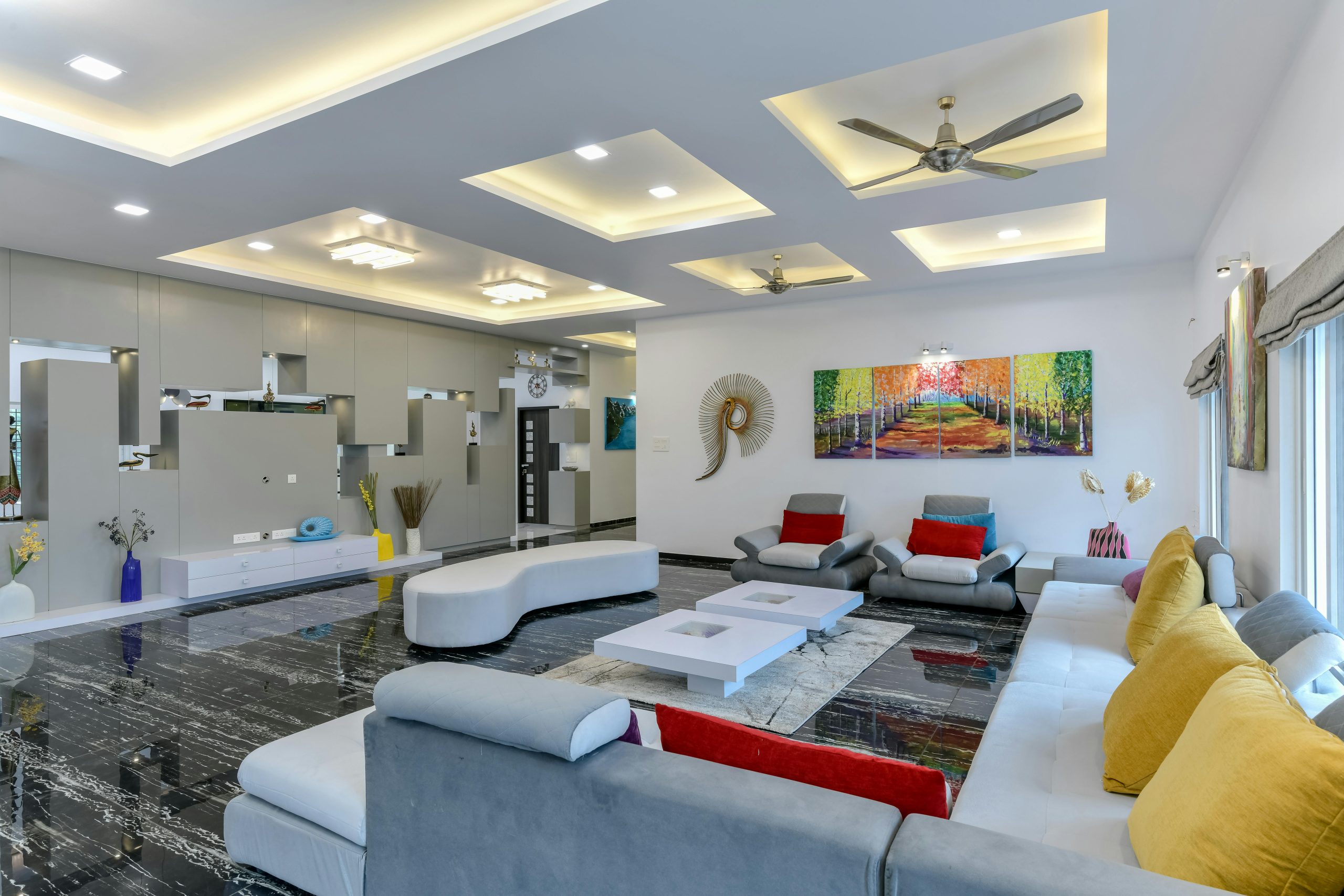
Maximalism is all about patterns, textures, visual layers, colours, objects and more. It should not be confused with cluttering a space. It can be achieved by editing clutter to tell a cohesive story. It’s become a major trend these days. Even with maximalism, form and function can meet style. It’s usually an interior design style chosen by people who want their space to be a reflection of their personality.
If you want to jump on to the “less is bore” or “more is more” bandwagon, we’ll tell you how exactly you can achieve it:
Choose a colour palette
When you’re in the initial stages of your maximalist design, decide on a colour palette. Speak to your interior design and figure out the mood you want to achieve. You can either choose warm tones such as yellow, red and orange or cooler tones such as blue, white and grey. Colour is the major consideration. Once you’ve decided on that, it becomes easier to select furniture, artwork and accessories.
Choose fun patterns and textures
When you’re designing a maximalist home, patterns and textures are key. Always remember, mixing patterns can be a process of trial and error. It’s not necessary that you will get it right the first time. Experiment and survey your space to see what’s working and what’s not. Think bold wallpaper, glossy furniture and vibrant accessories. If you’re planning to keep things on a coffee table, don’t just swamp them together. Instead, choose pieces that work in harmony and match your colour palette. If you’re choosing a wallpaper, you can add floral, geometric and animal print in the same room.
Incorporate historical references
A maximalist interior design draws inspiration from various styles, eras and cultural influences. Adding feature pieces, artwork and tapestries is the perfect way to add a sense of depth to your space. When you incorporate multiple textures, elements, patterns and colours together, the place ends up looking visually rich. Maximalism also celebrates individuality. It allows for personal expression. When you travel, make it a point to buy pieces and artwork that are truly distinctive and unconventional. An easy trick to achieve maximalism is to gather all your artwork and mount it on a single wall. This particularly looks great behind a sofa in a living room.
Layering is Key
A maximalist space is all about layering. Don’t be afraid to take the risk. You can achieve a balanced look by layering. Layer cushions, books on shelves, side tables, furniture and so on. This really allows your personality to come to life. The power lies in putting things in a group rather than ones or twos.
Plush furnishings
Finally, only playing with colours and patterns is not all. Fabrics and furnishings play an equally important role. Consider adding subtle elegance to your interiors. An intense upholstery colour is better than a dull one. Go in for deep hues such as red, green, blue, turquoise, sapphire, emerald, ruby, and mustard. You can even add a touch of gold here and there for some much-needed splendour. Velvet, suede, satin and silk create a rich look. For your cushions too, choose covers with 3D prints and embellishments.
Takeaway
There is a common misconception that function and style cannot coexist together. However, in any kind of interior design, function can meet style if done correctly. A haphazard interior design will go nowhere. Maximalism is characterised by arrangement tolerance. With that being said, it is important for all the elements to be chosen carefully. With “less is bore”, there is a greater exploration of possibilities. To create a space that is sensorially stimulating, seek help from someone who has completed a M.Des in Interior Design course. Since they’re well-versed with the art and science of interior design, they can help you achieve interior design of your dreams.


