Significance of Colours in Fashion Design
Imagine a world without fashion, and imagine fashion without colour! Strange, isn’t it? Colour is an essential component of fashion design. It sets the tone for a collection, evokes emotions and influences client perceptions. Only by looking at the colour of your collection, customers will base their judgements. As a fashion and apparel design student, understanding the power of colour is important. People usually associate bright colours with happiness and dull colours with sad emotions. When people see our clothes, the first thing they notice is the colour. This means, we’re all exposed to colour psychology in one way or the other. For instance, if you wear a particular colour all the time, it says a lot about your personality.
All fashion design courses in Bangalore have colour psychology in their curriculum. The definition is simple – it is just the psychological influence of colour on the functioning of a person. You can even say that various hues determine human behaviour. The colour of a person’s clothes can affect their mood, perception and nature.
Role of Colours in Fashion History
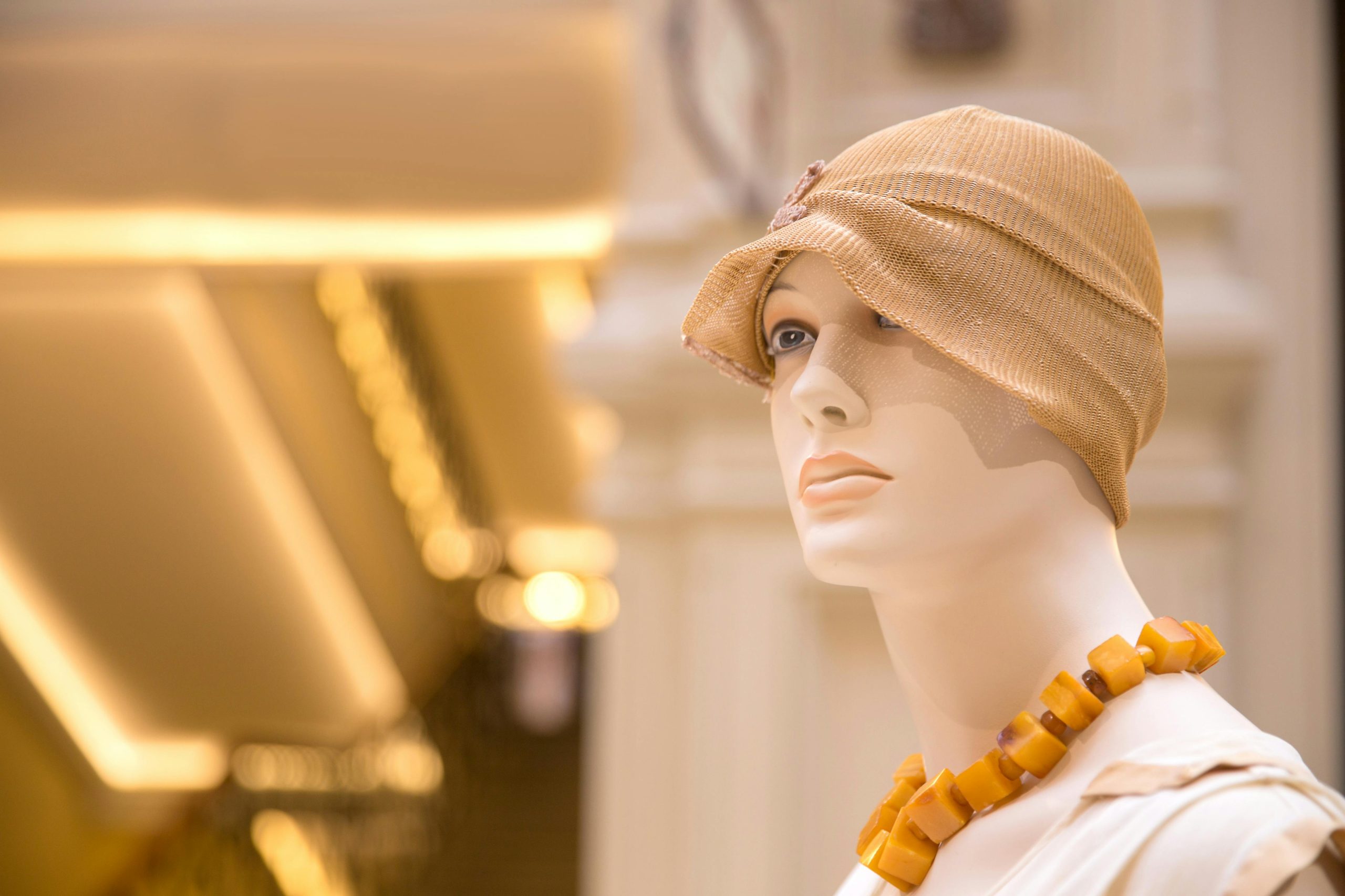
All throughout history, colour has been used in a myriad of ways. In the 1920s, bright colours were all the rage. Subdued pastels were also popular. Fashion in the 1920s was heavily influenced by the Art Deco movement. A few colours that were dominant during this era were green, yellow, red and blue. In the 1960s, London became the epicentre of fashion trends. A few signature colours during this time were forest green, brown suede, sunshine yellow and denim blue. Even polka dots, stripes and florals came into vogue. Yves Saint Laurent’s heralded the birth of solid colours. It was truly considered revolutionary during that time. In the 1980s, neon pink, green and yellow were trending. Even psychedelic prints and mismatched patterns were in style. People too were enjoying this colourful era and what fashion designers had to offer.
Came the 1990s, and a whole new fashion game took over. Bright colours were replaced by neutral hues and minimalism. Whites, beige, earthy tones and pastels seemed to be the order of the day.
Early 2000s fashion was dominated by shiny black tones, glitter and reflective metallics. The fashion of this era is also referred to as Y2K.
Post-COVID that is 2020 onwards, the world of fashion changed altogether. There were no specific colours. Neon, pastels, bright colours, everything seemed to be ruling various fashion runways. Consumers seem to be enjoying both minimalism and maximalism.
Needless to say, every decade had its own unique use of colour. The reason we’re highlighting the historical uses of colour is because it helps fashion designers even today create collections that are modern and timeless.
In today’s day and age, fashion designers are not afraid to play around with colour. In fact, they are using it in more and more interesting ways. Every designer follows a particular colour scheme. That’s what truly makes them unique. When you see a particular style and a colour, you will be able to tell the designer behind the collection. Using colour also creates brand recall and a visual impact.
The Emotional Spectrum of Colours
Let’s look at some of the most popular colours and the significance of them, and the emotions they tend to evoke:
- Red: It is a warm and intense colour. Symbolises love and excitement. The colour red evokes strong emotions such as passion and aggression. Marketing professionals usually use red to create a sense of urgency.
- Blue: It stands for serenity, calmness and even sadness. Wearing blue usually has a calming effect on the mind and body. Experts suggest that wearing blue can lower blood pressure and reduce heart rate. It is associated with the sea and the ocean and thus stands for relaxation and tranquillity.
- Green: Green is a colour associated with nature and harmony. It’s recognised for its soothing and balancing properties. It’s also linked to growth, freshness and renewal. Designers also associate it with envy.
- Yellow: When fashion designers use yellow in their collection, they usually associate it with sunshine, warmth and energy. It’s a colour that symbolises optimism, joy and happiness. If you want to feel energetic and creative, wearing yellow is a good option.
- Orange: Orange is a vibrant and energetic colour just like yellow. It also denotes enthusiasm and attention. It is usually used in marketing and design as it is attention-grabbing.
- Purple: It indicates wealth and wisdom. It’s also seen as a colour of sophistication and creativity. Luxury and high-end designers usually use purple in their collection. It creates a perception of artistry and imagination.
Conclusion
The power of colour in fashion design cannot be underestimated. It can help designers create collections cohesive with style and expression. As a new or experienced fashion designer, it’s important to experiment with various colours rather than only sticking to one colour. Are you interested in learning more about the power of colour in fashion design? As one of the best fashion design colleges in India, Vogue offers an array of courses that will teach you the ins and outs of fashion design, along with colour theory.