Importance of Scale and Proportion in Interior Design
In the world of interior design, several elements come together to make a cohesive unit. If a residential or commercial space looks visually-appealing, it’s because of the balance between an array of design elements including size, shape, colour and texture. This balance is referred to as scale and proportion. These two terms are often used interchangeably and are very important in interior design. When these principles are applied to furnishings and decorative pieces in a room, one can truly create a stunning aesthetic. If you just add furniture and elements everywhere, the space will feel cluttered, uncomfortable and uninviting. When you adhere to the principles of form and scale, you will be able to create a harmonious balance. It will also reflect your unique style.
What is Scale and Proportion in Interior Design?
Interior designers have been studying scale and proportion for a few years. Quite often, it can get confusing too. Scale helps designers understand an item in relation to the size of the room. It’s understanding how one object will look in a space along with the other objects in the room. Proportion on the other hand is used to measure an object in relation to the other things in the room. It focuses on specific design elements including size, shape, texture and colour. Proportion is usually connected to parts of the whole.
Scale and proportion go hand-in-hand. It helps in creating a perfect balance in the room.
6 Tips to Incorporate Scale & Proportion in a Home
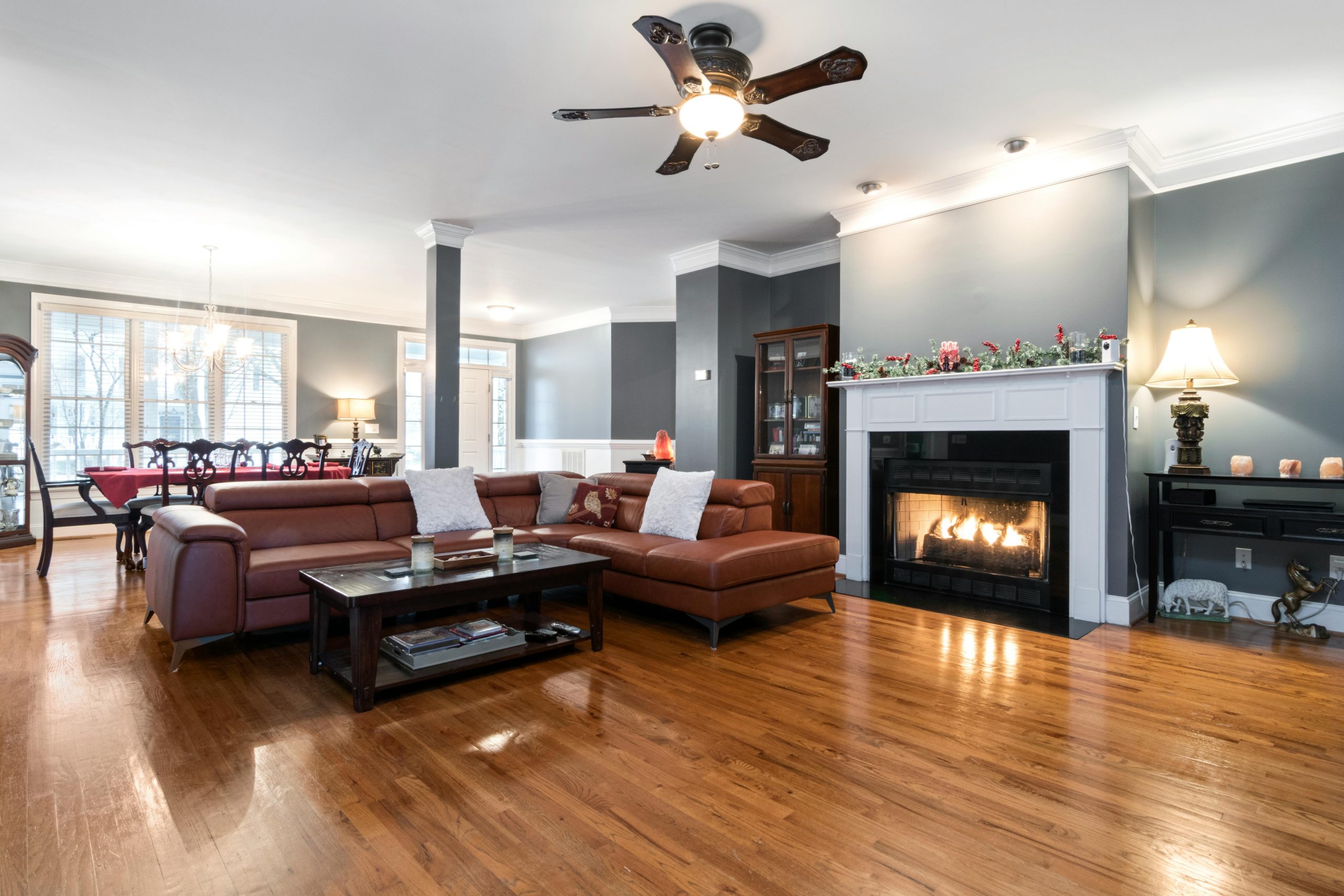
As mentioned earlier, balance is important in a room. With scale and proportion, you can easily achieve this. For example, it’s wrong to place a large couch in a small room and vice-versa. In this case, the designer might say that the object is not to scale or not to proportion. Following certain interior design principles allows natural flow and rhythm. Students studying design and decoration courses are also taught about scale and proportion. To become a successful interior designer, knowing how these two elements work is important.
In this blog, we’ll share a few tips on how you can incorporate scale and proportion in your home:
Colour Palette
When it comes to choosing the colour for a room, follow the 60-30-10 rule. Primary, secondary and accent colours need to be balanced in order to maintain a visual composition. The colours should be in sync with the furniture, curtains and rugs.
Choose design elements according to ceiling height
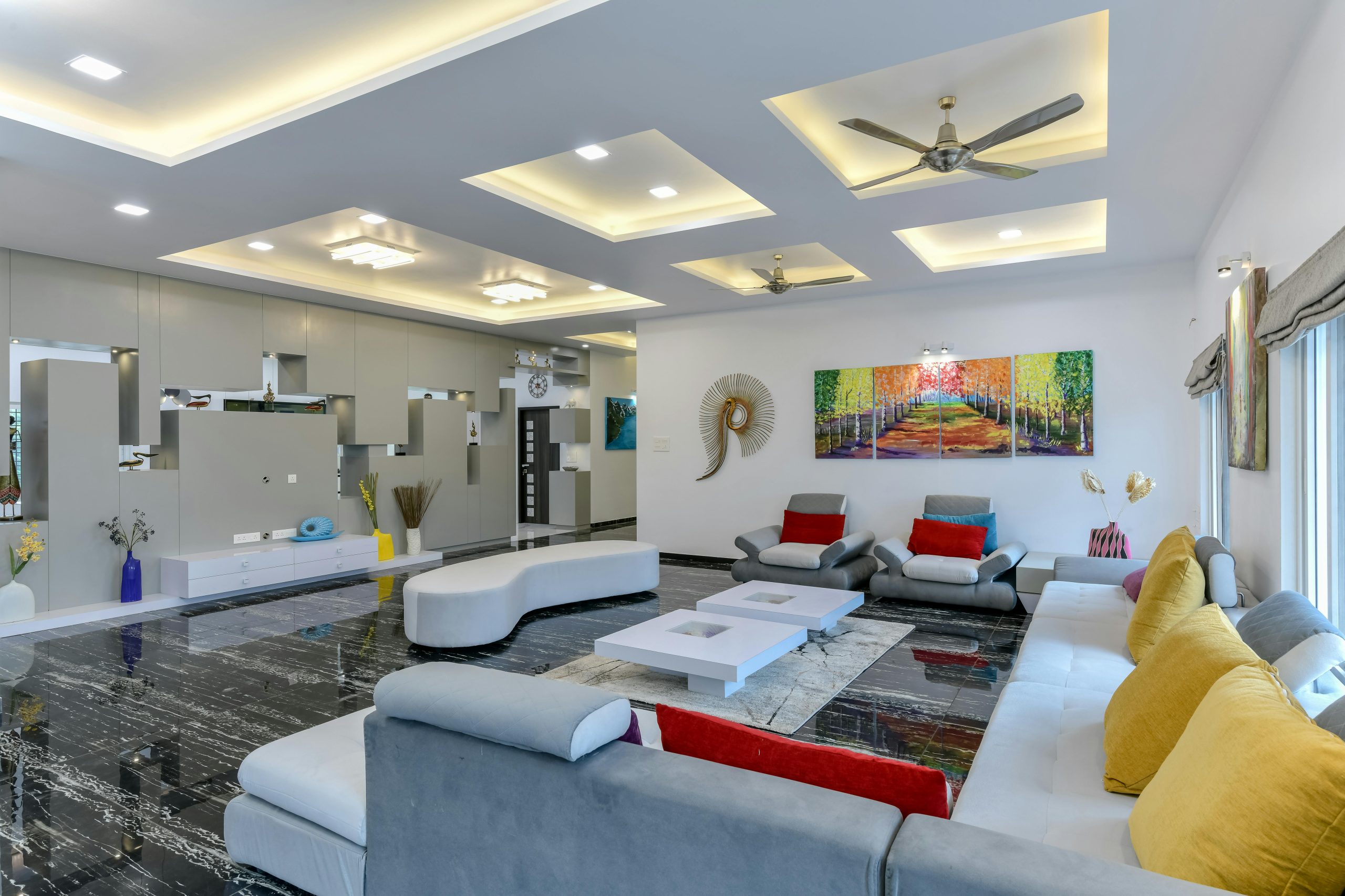
High ceilings call for large, statement furniture whereas low ceilings call for furniture that is small yet functional. Consider the scale of your mouldings as well. You can even add style and substance to your ceiling by opting for a false ceiling. When you’re considering scale and proportion in a room, take into account the overall architecture. These little things can impact how a space looks.
Furniture choices
When you’re designing a room, decide which piece of furniture you want as the most important one. Have one piece as the central one, and then build the rest of your furniture around it. For example, in a bedroom, the bed is usually the central furniture piece around which there is smaller furniture such as side tables, chest of drawers, dressing table, and so on.
Maximise negative space
Negative space in interior design refers to leaving a few empty spaces in a room. Don’t make a room’s design look too busy. It’s important to leave certain areas blank. For instance, if you’re having paintings in a room, make sure there is enough white space around it. It’s better to let the walls breathe rather than covering every square.
Repeat patterns and shapes
To balance proportions of a space, repeat shapes and patterns. This is pleasing to the eye as well. Recurring patterns creates unity within a room. You can even mix and match patterns. However, don’t go overboard with repetition. Patterns of different scales add visual interest and maintain harmony.
Light proportion
Every experienced interior designer knows that in any given space, there should be a good mix of natural light and artificial light. No doubt that light makes a room look bigger and creates an illusion of space. When objects are placed strategically, light bounces off them. Designers can also use mirrors and light colour tones to balance the light evenly in a room.
Final Thoughts
Scale and proportion are essential elements of design. Using these two concepts definitely makes a room/home more welcoming. As a budding interior designer, it is important to understand the needs of a room and then use scale and proportion accordingly. At Vogue, we have interior design courses that give students theoretical as well as practical knowledge.


